Mobile App User Experience for Lebanon and GCC Businesses
 12 Oct
Mobile App User Experience for Lebanon and GCC Businesses
Mobile app user experience is what decides whether Lebanese and GCC customers finish a booking, a payment, or a support request—or delete the app after one confusing session. Fancy screens do not fix a slow first launch, a broken Arabic layout, or a checkout that fails on weak mobile data. This guide is for business owners who will pay for a build and need plain criteria to judge the UX before launch.
Step To Media builds apps from Mkalles as a software development agency in Lebanon, with delivery across the GCC. Our mobile app development work covers iOS, Android, and related product decisions. This article is not a design tutorial and not a vendor directory. For wider company positioning, see the software and web development company in Lebanon hub.
What mobile app user experience means for a buyer
UX is the path a real person takes to complete a job: sign up, find a product, pay, track an order, or message support. UI is the visual layer. You can have polished icons and still lose users if the path is long, the Arabic text wraps badly, or the app assumes perfect Wi‑Fi.
Ask vendors to describe UX in outcomes you can test:
- How many taps to finish the primary task on day one?
- What happens when the network drops mid-payment?
- Does Arabic appear correctly with right-to-left layout from the first sprint?
- Can a first-time user succeed without a call to your staff?
If answers stay vague (“we follow best practices”), the brief is not locked yet. User testing methods are covered separately in user testing in mobile app development—this post focuses on what to demand in the product itself.
Lebanon and GCC constraints that change app UX
Regional products fail when they copy a Western template and paste Arabic later. Local reality shows up in the first week of use.
Language and right-to-left layout
Customer-facing apps in Lebanon and the Gulf often need Arabic and English. Arabic is not only translation: layout direction, number formats, and form labels must be designed for right-to-left from the start. Retrofitting RTL after wireframes are approved usually reworks navigation, icons that imply direction, and date pickers. Practical notes for Arabic builds live in Arabic mobile app development. Website RTL patterns (useful when the app shares a web portal) are in bilingual Arabic–English websites.
Connectivity and device mix
Users move between office Wi‑Fi, mobile data, and elevators. UX that only works on a fast connection looks fine in a demo and fails in the field. Ask for clear loading states, retry on failed requests, and sensible offline or “last known” behavior for read-only screens where it is safe.
Payments and local habits
Checkout UX is part of the product, not a plugin afterthought. Card flows, wallets, and cash-on-delivery confirmation each need their own success and failure screens. Keep payment scope explicit in the brief; do not assume one gateway covers every market you sell into.
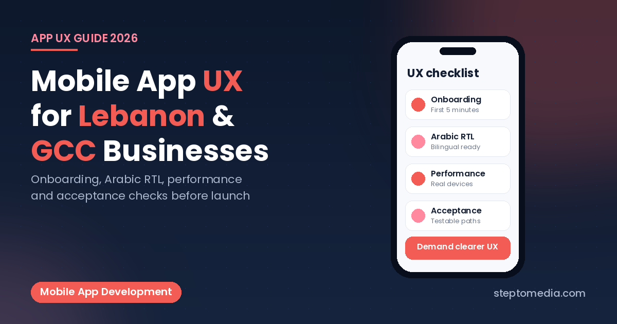
Onboarding and the first five minutes
Most uninstall risk sits in the first session. A strong mobile app user experience keeps the first path short.
- Account creation: ask only for what launch needs. Extra fields belong in a later profile screen.
- Permissions: request location, notifications, or camera when the feature needs them, with one sentence why—not as a wall on open.
- Empty states: if there are no orders yet, say what to do next instead of a blank list.
- Guest or browse mode: when the business allows it, let people explore before forcing a login.
Write three acceptance sentences for onboarding. Example: “A new Arabic-preferring user can create an account, see the home screen, and start the primary task in under two minutes on a mid-range Android phone.”
Navigation, forms, and error messages
Business owners can review these without being designers.
| Area | What “good” looks like | Red flag |
|---|---|---|
| Primary navigation | Three to five clear destinations; the main job is one tap from home | Hidden actions behind nested menus |
| Forms | Inline validation, correct keyboard types, Arabic labels that do not clip | Errors only after submit, in English only |
| Search and filters | Results update in a way users understand; empty results suggest a fix | Silence when nothing matches |
| Errors | Human language plus a retry; payment errors name the next step | Raw codes or a generic “Something went wrong” |
| Accessibility basics | Readable type size, contrast that works outdoors, tap targets that are easy to hit | Tiny icons only, low-contrast gray text |
Apple publishes Human Interface Guidelines and Google publishes Material Design guidance for platform conventions. Use those as reference when you debate patterns; they are not a substitute for testing with your own customers. Official docs: Apple HIG and Material Design 3.
Performance as part of UX
Speed is experience. A beautiful screen that takes eight seconds to appear on a common local device will be judged as broken. Agree early on:
- Target devices for acceptance (at least one mid-range Android and a recent iPhone).
- Cold-start expectations for the home screen on mobile data, not only office Wi‑Fi.
- Image and list behavior so scrolling stays usable with large catalogs.
Native versus cross-platform choices affect feel and release cadence. If that decision is still open, read native vs cross-platform mobile apps and Flutter vs React Native for Lebanon and the GCC. UX criteria above still apply either way.
How to brief UX without writing a novel
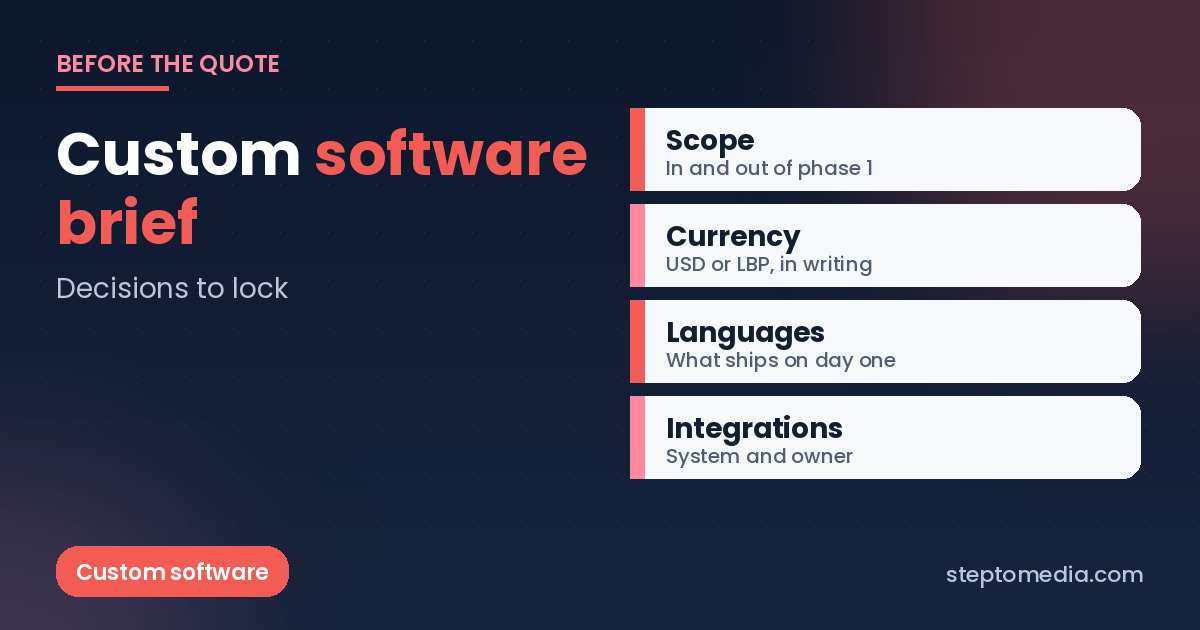
You do not need a 40-page specification. Lock a short UX brief before build quotes harden:
- The one primary job the app must complete in version one.
- Languages on day one, default language, and whether RTL is required.
- Who the first users are (customers, staff, both) and on which phones they mostly work.
- Must-have flows: signup, main task, payment or request, support contact.
- What is out of scope for UX in phase one (loyalty, social feed, multi-brand themes).
- Three to five acceptance sentences a non-developer can run on a physical phone.
If the product is really a logged-in portal that also needs a public marketing site, keep those scopes separate and involve website development or custom software development as needed—so the app brief stays focused.
Questions business owners ask about app UX
What is mobile app user experience in plain terms?
It is how easily a real person completes important tasks in your app: signing up, finding what they need, paying or submitting a request, and recovering when something fails. Visual style matters, but task completion and clarity matter more for business results.
Why does Arabic change mobile UX so much?
Arabic needs right-to-left layout, careful typography, and mirrored navigation patterns. Adding Arabic after English-only screens are built often forces redesign of forms, icons, and flows. Plan bilingual UX from the first wireframes when your customers need Arabic.
Is UX the same as user testing?
No. UX is the product experience you design and build. User testing is how you validate that experience with real people. You need both: clear UX requirements in the brief, then structured tests before a wide launch.
Can we reuse our website design as the app UX?
Some brand colors and content can carry over, but mobile apps need thumb-friendly navigation, shorter forms, and platform patterns that differ from a desktop website. Treat the app as its own product with its own acceptance checks.
How do we know the UX is ready for launch?
Run your acceptance sentences on physical devices in Arabic and English, on mobile data, including payment or request failure paths. If staff still need to coach every new user through the main task, the UX is not ready.
Should UX be a separate line item in the quote?
It should be visible as discovery, wireframes or prototypes, and design-system work tied to phase-one flows—not a vague “design included.” If UX is invisible in the quote, scope arguments usually appear mid-project.
Next step
If you are scoping an iOS or Android product for Lebanon or the GCC, contact Step To Media with your primary task, languages, and three acceptance sentences. We will tell you what is estimable now and what needs a short UX discovery. You can also email info@steptomedia.com or call +961 3 510 646.
No next post available