Website Conversion UX for Lebanon SMEs: Speed, Trust, and Forms That Convert
 22 Sep
Website Conversion UX for Lebanon SMEs: Speed, Trust, and Forms That Convert
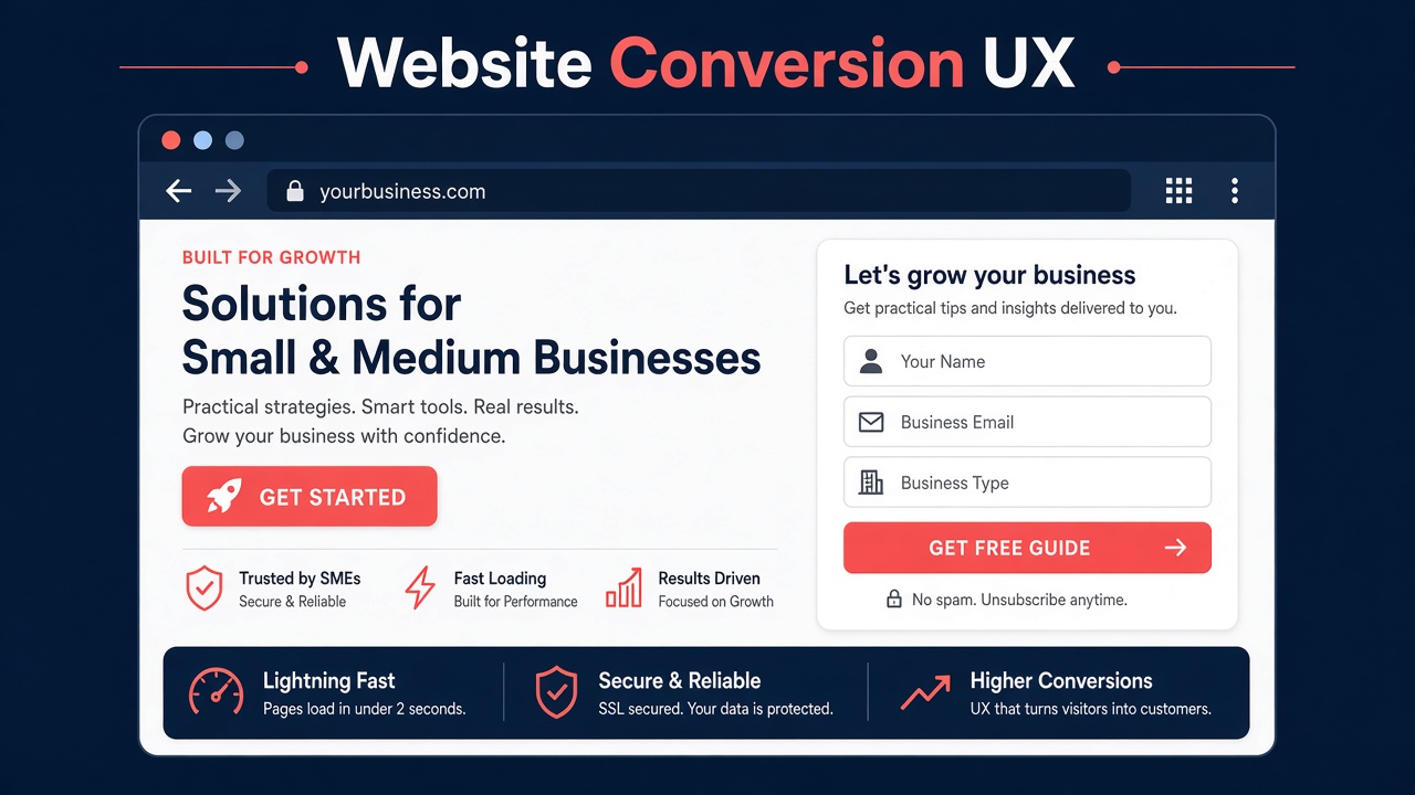
Website conversion UX Lebanon teams need in 2026 is not a bag of SEO tricks. It is the craft of helping a real person on a real phone—often switching between Arabic and English, often one tap from WhatsApp—decide to inquire, book, or buy without friction. Speed, trust, and form design do more for most SMEs than another paragraph of homepage slogans.
This article focuses on conversion-oriented UX for Lebanon and GCC small and mid-sized businesses: Core Web Vitals as user experience (not as a ranking-only checklist), bilingual trust signals, WhatsApp CTAs, form UX, mobile-first patterns, and local payment/trust cues. It intentionally avoids turning into a pure SEO playbook.
Step to Media is a software development agency in Mkalles, Lebanon, offering website development, mobile app development, custom software solutions, and TV apps for web, iOS, and Android. See our software development agency in Lebanon hub, or contact us (info@steptomedia.com · +961 03 510 646) when you want a conversion-minded rebuild or redesign.
What “conversion” should mean for an SME site
Conversion is the completion of a valuable action you defined. For many Lebanon SMEs that is not only “purchase”:
- WhatsApp inquiry with enough context to qualify
- Contact or quote form submit
- Booking or reservation
- Catalog request / dealer locator
- Account signup for a portal or service
Pick one primary conversion per key template (home, service, product). Secondary actions can exist; competing primary buttons usually cancel each other out.
If you are still choosing who should build or rebuild the site, pair this UX lens with how to choose a website development partner in Lebanon.
Speed as UX: Core Web Vitals without the SEO fog
Core Web Vitals (LCP, INP, CLS) matter because slow, janky pages feel untrustworthy—especially on mid-range Android devices common in the region. Treat them as experience metrics:
| Vital | User meaning | Practical SME fixes |
|---|---|---|
| LCP (largest contentful paint) | “Did the main content appear quickly?” | Compress hero images, prioritize above-the-fold media, avoid huge carousels as LCP candidates |
| INP (interaction to next paint) | “Did the tap feel instant?” | Reduce heavy third-party scripts; defer non-critical JS; keep menus and CTAs responsive |
| CLS (cumulative layout shift) | “Did the page jump while I read?” | Set image/video dimensions; reserve space for embeds; avoid injecting banners above content after load |
Speed habits that convert
- Host and CDN choices that work for Lebanon and GCC visitors—not only a US-origin default.
- Limit marketing pixels on landing templates until the funnel is healthy.
- Prefer one strong hero image over autoplay background video on mobile.
- Lazy-load below-the-fold galleries; never lazy-load the primary CTA area’s critical assets incorrectly.
- Measure on real devices and throttled networks, not only a developer laptop on fiber.
Speed work is part of serious website development—not a plugin afterthought.
Trust signals that fit bilingual Lebanon / GCC buyers
Trust is cultural and local. Generic stock photos of handshakes rarely help. Signals that tend to work:
- Clear company identity — Mkalles / Lebanon (or GCC) address cues, real team or workspace photography when possible, and consistent naming.
- Bilingual credibility — if you claim Arabic + English service, the UI, not only a flag toggle, must feel finished in both directions. Deep guidance: bilingual Arabic/English RTL websites.
- Proof without fiction — real project names you are allowed to show, recognizable sector experience, or verifiable partner logos—never invented metrics.
- Contact transparency — phone, WhatsApp, email, and response-time expectations on key pages.
- Policy clarity — shipping, returns, cancellation, or consultation terms in plain language.
- Secure checkout cues when you sell online — HTTPS everywhere, visible payment method honesty, and no surprise fees at the last step.
For commerce-specific architecture (catalogs, checkout, regional payments), see ecommerce website development for Lebanon & the GCC.
WhatsApp CTAs: powerful when designed, spammy when bolted on
WhatsApp is often the highest-intent channel for Lebanon SMEs. UX mistakes are common.
Do
- Place a primary WhatsApp CTA near the decision moment (price section, service package, product detail)—not only a floating button fighting the thumb zone.
- Pre-fill a short message template with page context (“Hi, I’m interested in [Service] from [Page]”).
- Label the action clearly: “Chat on WhatsApp” / Arabic equivalent—not a cryptic green icon alone.
- Keep business hours or response expectations nearby if overnight replies are unlikely.
- Track clicks as a conversion event in analytics (without breaking performance).
Don’t
- Open three chat widgets (WhatsApp + Messenger + generic chat) that cover content.
- Force WhatsApp as the only path when some buyers need formal email or a form for procurement.
- Use personal numbers that change with staff turnover—prefer a stable business entry point.
WhatsApp should accelerate conversation, not replace structured lead capture when your sales process needs fields (budget, city, company size).
Form UX that people finish
Forms are where conversion often dies. Short beats clever.
Field discipline
- Ask only what sales needs for the first reply. Company size can wait.
- Use one-column layouts on mobile.
- Label outside the field; placeholders are not labels.
- Mark optional fields explicitly; do not assume stars are understood the same in every language.
- Support Arabic input comfortably (font, alignment, validation messages in the active language).
Error and success states
- Validate inline where helpful; never clear the whole form on one mistake.
- Success pages should confirm what happens next (“We reply within one business day”) and offer WhatsApp as an alternate path.
- Avoid CAPTCHA that blocks legitimate mobile users; use quieter spam defenses when possible.
Multi-step when it helps
Multi-step forms work for complex quotes (e.g., fit-out, software scope, bulk orders) if progress is visible and back-navigation preserves answers. For “Call me back,” one screen is enough.
Mobile-first patterns that respect how people browse
Most SME traffic is mobile. Design the phone experience first, then enhance desktop—not the reverse.
Practical patterns:
- Thumb-friendly primary CTA — fixed or sticky only if it does not hide content; test with real hands.
- Readable type — comfortable body sizes; avoid ultra-light gray text on bright outdoor screens.
- Tap-sized controls — especially language switchers and accordion FAQs.
- Compressed navigation — fewer top-level items; clear “Services / Work / Contact” beats clever labels.
- Click-to-call beside WhatsApp when phone conversations close deals.
- Lightweight menus — mega-menus that work on desktop often fail on small screens.
Legacy sites that feel “fine on desktop” but sluggish on Android are prime candidates for modernization. When the stack itself is the bottleneck, evaluate rebuild vs patch with your partner—conversion UX cannot overcome chronically slow themes forever.
Local payment and trust cues (without overclaiming)
Even brochure sites borrow trust language from how money moves locally:
- Show how people can pay or engage (bank transfer instructions after quote, card via gateway, cash on delivery where relevant)—only what you truly offer.
- For stores, display currency and fee behavior early (USD/LBP display policies, GCC currencies) to reduce checkout abandonment.
- Prefer honest “request a quote” when pricing is scoped—not fake “Buy now” on custom services.
- Keep payment logos accurate; do not display methods you have not enabled.
Conversion UX includes commercial honesty. Surprises at payment or contracting time destroy the goodwill your design earned.
A conversion UX checklist for your next release
Use this as a pre-launch or quarterly review:
- Primary conversion defined per key template
- LCP/INP/CLS checked on a mid-range Android + common iPhone
- Hero message understandable in 5 seconds in AR and EN
- WhatsApp CTA with context + one alternate contact path
- Form ≤ necessary fields; success state explains next step
- Trust block with real proof and clear contact
- No layout shift from late-loading banners
- Analytics events for CTA, form submit, WhatsApp click
- Legal/contact pages linked in footer
- Owner named for ongoing content and speed budgets
How agency delivery should support conversion
A development partner should not toss a visual comp over the wall and disappear. Conversion-minded delivery includes:
- Performance budgets in the build
- Component-level CTAs and forms, not one-off page hacks
- Bilingual/RTL QA
- Staging tests on real devices
- Post-launch iteration based on observed drop-offs—not vanity redesigns
That is the posture behind Step to Media’s website development work and our broader role as a software development agency in Lebanon—web first when the funnel is web, with mobile or custom systems when the product requires them.
FAQ
Is conversion UX the same as SEO?
No. SEO helps people find you; conversion UX helps them act when they arrive. Some technical overlap exists (speed, clarity), but keyword tactics alone will not fix confusing forms or slow mobile pages.
Should every page push WhatsApp?
No. Product and service pages often should; articles may use softer CTAs. Overusing WhatsApp widgets trains users to ignore them.
How many form fields are too many?
If a field is not required for the first human reply, cut it from phase 1. You can enrich the lead later in sales conversations or CRM.
Do we need a full redesign to improve conversion?
Not always. Sometimes CTA hierarchy, form shortening, image compression, and bilingual trust blocks move the needle. Redesign when information architecture or the theme stack blocks further gains.
What should we send an agency before a conversion-focused engagement?
Analytics access (or exports), top landing pages, current primary conversion definition, language requirements, and examples of competitor sites you admire—plus any brand constraints. A short loom of a user failing to inquire is gold.
Soft next step
If your Lebanon or GCC site attracts visits but few conversations, start with speed, trust, and forms—not another slogan. Contact Step to Media at info@steptomedia.com or +961 03 510 646 (Mkalles) to review your key templates and plan a conversion-minded website improvement or rebuild grounded in how your buyers actually inquire.
No next post available